How Maps Became Modern
Welcome!
This is a companion site to the book, Mapping the Nation, which explores a tremendously creative era in American cartography.
From maps of disease and the weather to the earliest maps of the national population, this was a period when the very concept of a map was reinvented. By the early twentieth century, maps had become common tools of analysis, communication, and visual representation in an increasingly complex nation.
Today we live in a world that is saturated with maps and graphic knowledge. The maps on this site reveal how this involved a fundamentally new way of thinking.
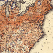
Browse Images by Book Chapter
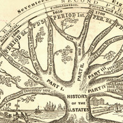
After the Revolution, historical maps became one of the most common and appealing ways to cultivate national loyalty in young Americans. Here you can trace the origin of historical atlases and timelines, and the spread of graphic illustrations of national history.
View Chapter One Maps »
Antique maps may command high prices today, but this wasn't always the case. Here we examine how old maps came to be considered valuable, which was related to the rising popularity of historical atlases and the campaign to create a national archive of maps at the Library of Congress.
View Chapter Two Maps »
Here you can learn how medical men turned to maps in an urgent quest to solve the deadly mysteries of yellow fever and cholera. Their groundbreaking work was closely related to the race to map the environment in a nation that was rapidly expanding westward.
View Chapter Three Maps »
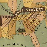
The sectional crisis sparked tremendous creativity in mapmaking, as Northerners began to use maps to measure the extent of slavery. This includes the first statistical maps of population made in the United States, which even captured the attention of President Lincoln during the Civil War.
View Chapter Four Maps »
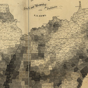
After the war, the federal government sponsored the first national atlas based on the census. Here you can see how leaders experimented with cartography to measure the nation in new and unexpected ways, from the characteristics of its population to the distribution of its natural resources.
View Chapter Five Maps »