The future of thematic mapping?
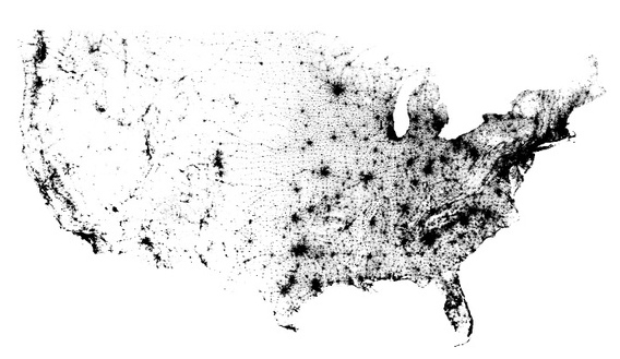
Several people have sent me this population map, made by Brandon Martin-Anderson, which represents one dot for each person counted in the 2010 U.S. Census. The link takes you to an interactive and zoomable version that illustrates the broad and specific patterns of settlement.
When I first came across the map, I didn’t pay much attention. I mistakenly assumed that it was just one more of the many thematic maps that have become altogether routine in the past few years. But Michael Buehler of Boston Rare Maps drew my attention to its importance: it is in fact the opposite of most thematic maps, which are premised on some measurement of statistical data, represented as a layer of information.
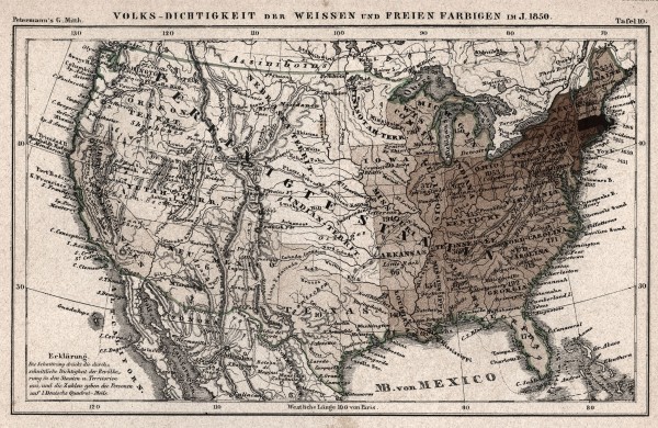
Most population maps made in thelast two centuries began by establishing a system of data representation, such as the use of shading to indicate density per square mile, or the use of scaled circles to depict the relative size of cities. For example, here is the earliest map I have found of the American population, made by a German in 1855 based on the 1850 Census. The map was made by August Petermann, who sought to depict the number of whites and free blacks per German square mile (an antiquated form of measurement, about 31 times the size of a U.S. square mile).
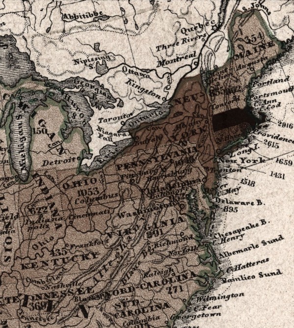
Here Petermann was translating statistical data into visual form. Thus he needed to explain how his visual technique represented the system of measurement. Each state is shaded according to its relative population density per [German] square mile; the number on each state represents the statewide average of that figure.
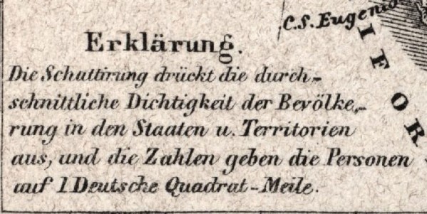
Here is Petermann’s explanation, that the shading represents relative density per German square mile.
By contrast, the new 2012 census dot map represents raw data: each person is simply marked as a single dot, and the aggregation of those dots becomes the overall technique of representation. In this respect the interactive map depicts the population as an element of the natural landscape, not really different from the presence of a river or a street. In other words, there is no intermediate step of measurement in the technique of representation. Perhaps my lack of cartographic training is showing here — no doubt all maps are abstractions of one kind or another. But I’m intrigued by what modern technology (here the ability to zoom in) means for the ability to think anew about mapping information.
I welcome your input on the concept behind this map, and thematic mapping generally. Special thanks to Michael Buehler for alerting me to the unique quality of this map.
UPDATE: I thank John Cloud and Chris Lane for discussing the details of the dot map with me and pointing out my errors of interpretation. As they both observed, the recent census map is not fundamentally different from Petermann’s early attempt to map the population. The new map seemed to me to present data differently, with the dot symbolizing the individual rather than a scale of measurement. But as Chris Lane points out, it is not a conceptual departure from previous maps that came prior. Still, I welcome your comments on the new map, and what we can learn from this technique of population mapping.

Use controls to zoom and pan.


OK, I finally examined the “US Census map”. Drilling down into the map, plus following the link to the original source, and his FAQs, both confirm that the map does NOT represent people where they actually live as represented by dots. The lowest level of spatial aggregation of any data from a “recent” US Census is the census block, which is a unit of area that can vary enormously in size. There are also collection blocks and tabulation blocks– it gets complicated. See:
https://www.census.gov/geo/www/geo_defn.html#CensusBlock
As the map’s creator clearly states, and is evident upon visual inspection, the map’s program took populations for each 2000 Census census block (or aggregations of other kinds of blocks– it gets complicated) and then RANDOMLY placed the requisite number of dots within the boundaries of the census block. Find, on any part of the original map, a place you are familiar with, like where you actually live.Drill down on the map there to the finest scale allowed. You’ll see immediately that the dots are in patterns that do not correspond to the actual population densities of your town or community. In fact, this same technique could be used to apply dot/human shading to the US population in 2000 as distributed per Deutsche Quadrat-Meile. It is in fact no different than August Petermann’s technique in 1855.
Three map characters are discussed by you and Messrs. Cloud and Lane:
1. actual population densities
2. total population
3. Petermann’s layer of thematic information: the number of whites and free blacks per unit of area.
All three in a geographic relationship, using distance/area representations based on Mercator projection distortions of the sphere.
I tend to agree with the observations of Messrs. Cloud and Lane, to wit, there is no conceptual difference between the Petemann and “dot” maps: both are thematic. Both are aggregations of data in two-dimensional space, with Petermann providing two layers of information: geopolitical boundaries and relative ethnic differences compared tot the “dot” map of one layer. That map as Mr. Cloud points out does not represent the true geographic densities. It is assumed that most audiences can best grasp the messages about persons in two-dimensional geopolitical space by using the geographic Mercator projection map as the foundation. However, some might get a message more clearly or powerfully if geopolitical units were exaggerated according to some data relationship.
Trends by decade would also be of interest to some audiences. Trends could be shown as a sequence of maps or as total populations or percentage changes over a period of time on a single map. I tend to think of maps as representing historical continuity and flows: what has been, what is and what might be. What if Petermann had made the maps of his data for 1865 and 1875 as well as 1855?