Mapping the progress of the Union Army
One of the most intriguing cartographic developments in the nineteenth century was the effort to map the past. Experiments with historical mapping can be found in the eighteenth century, but the spread of inexpensive printing–as well as schooling–made visual representations of the past far more common.
While many of these new historical atlases used a series of maps to represent change over time, it was far more difficult to represent that change in a single image. I’ve covered some of these efforts in chapter two of Mapping the Nation, particularly those of Emma Willard in her pathbreaking atlas of American history in the late 1820s. In the 1850s, the United States Coast Survey funded the experimental work of a visiting German–Johann Georg Kohl–who executed three breathtaking maps of coastal exploration (see here, here, and here!). Kohl used lines to represent individual voyages, and the result is a colorful, appealing, and elegant representation of centuries of discovery.
This task of representing change over time became especially acute for the Federal Government during the Civil War, when the imperative of showing progress led to a lasting technique of depicting the evolution of the war from 1861 to 1865, one that we still see used today. Given its prior experimentation with mapping techniques and the representation of data, it’s not surprising that the innovation again came from the Coast Survey.
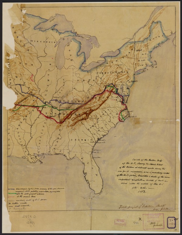
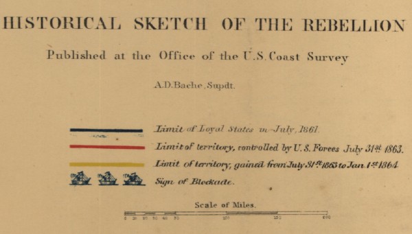
The story begins in the spring of 1862, when the capture of New Orleans infused the Union with a sense of optimism that victory was not far off. In response, a Henry Lindenkohl–a German working at the Survey–designed a prototype for a series that would sketch the progress toward defeat of the rebellion.
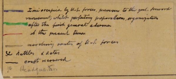
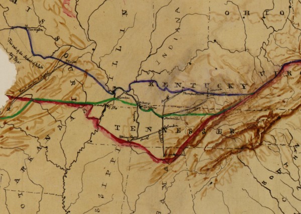
The task was to represent the shifting fortunes of the military on both land and sea. In the prototype, Lindenkohl uses a series of brightly colored lines to show the gradual reconquest of southern territory.
The goal was to identify battles, the path of the military, conquered coasts, and headquarters in the field, all in order to give a comprehensive picture of the overall progress toward victory.
The colored lines indicated advances from early 1862, as well as the recent victories at New Orleans and (below) at Shiloh.
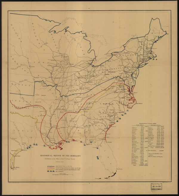
The prototype led to no less than six subsequent “historical sketches,” almost all drawn by Lindenkohl. They were not made at regular intervals–long stretches of stalemate prompted no new maps, while in July 1863 three separate maps were made to capture the progress on the Mississippi River. Here for instance is the map of January 1864, which depicts enormous and encouraging progress in the west.
There were no shortage of war maps for the northern public, but these were unique, recording conflict as a story of territorial control rather than discrete battles. Indeed they were a kind of first draft of history, an attempt to create a story where the outcome was not as yet unknown. Yet in generalization, they imply a steady state of progress and control that was at odds with the chaos on the ground.
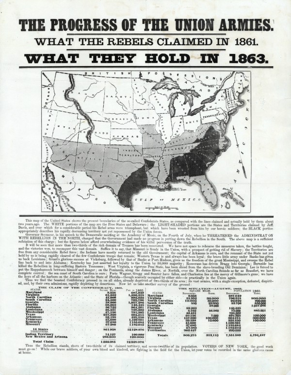
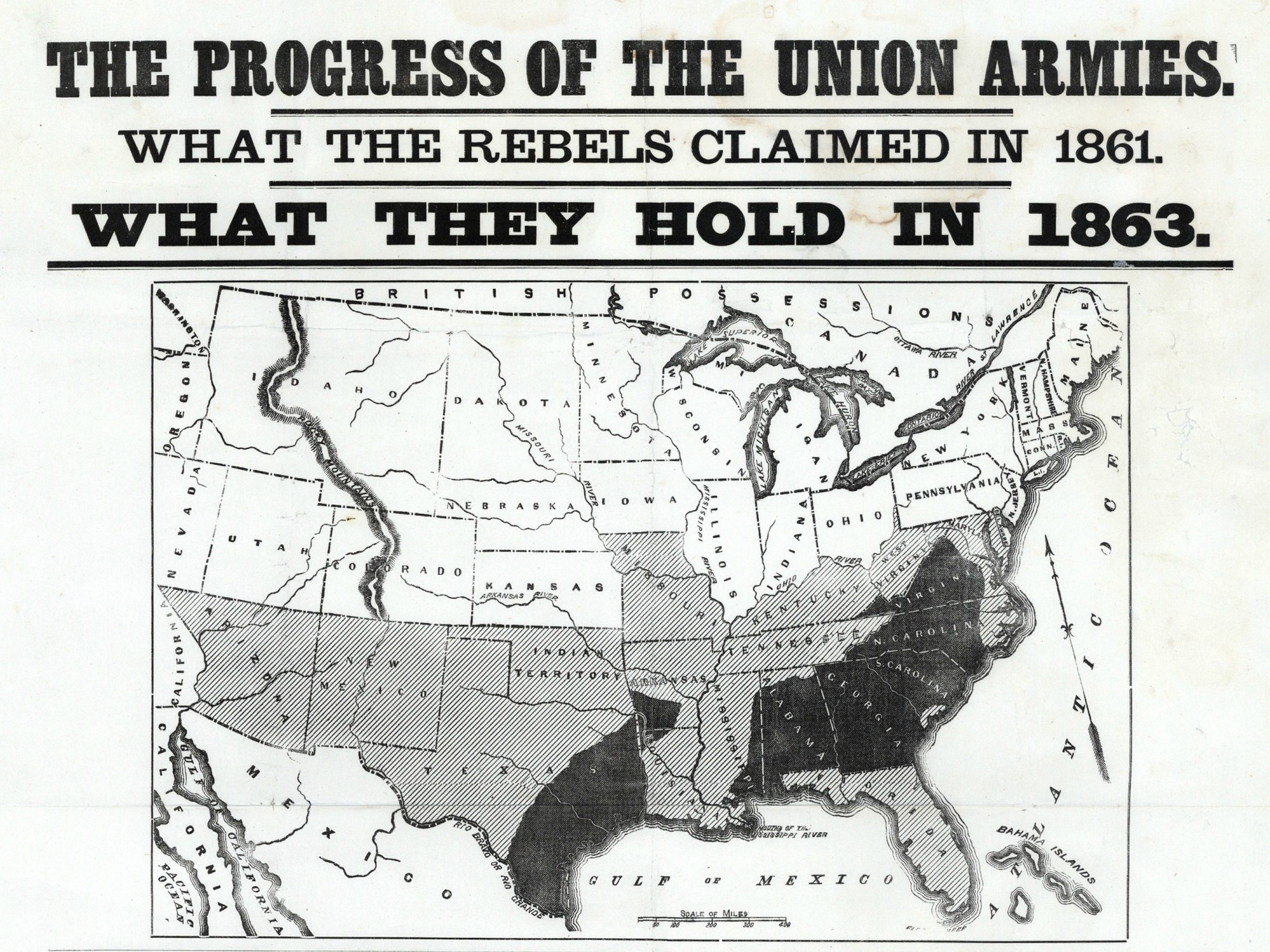
What strikes me here is the way that this technique catches on so quickly. I have found several examples during the war. First, consider this broadside of summer 1863, made by loyal Unionists to defend against the increasing criticism of the war led by the Democrats, particularly New York Governor Horatio Seymour. The text under the map decries the Copperheads for their skepticism. No doubt the broadside hoped to quell draft resistance as well, which reached a peak in the summer of 1863 in the New York City Draft Riots.
Again, one thing that strikes me about the use of such imagery is the suggestion of ongoing territorial progress. Such a depiction allows little room to acknowledge the notorious reversals of territorial control in the east. But to boost the flagging spirits in the Union, the image was compelling indeed, supported by extensive statistics of square miles and population under Union control.
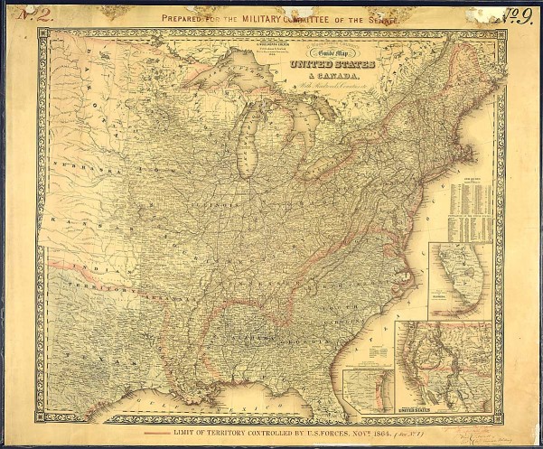
This same technique was adopted to illustrate the progress of the war for the Senate. In November 1864, Richard Delafield of the Army Engineer Bureau annotated this existing Colton railroad map to demonstrate the territory controlled by the military. The coloration is rather faint, but notice that he has highlighted–on both the main and the inset maps–the extent of territory and coastline then under control of the Union forces. As with the Coast Survey maps, notice how the technique indicates absolute territorial control, as a way to buttress the understanding of progress toward total victory. [Apologies for the poor quality of the image — it has not yet been scanned at high resolution.]
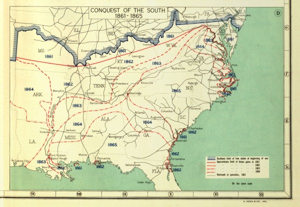
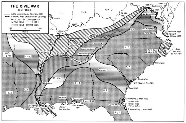
The technique lasted well into the twentieth century. First it was adopted in the massive Historical Atlas of the United States, edited by Charles Paullin and John K. Wright.
Thereafter, it became a standard fixture in histories of the Civil War and American history textbooks. Perhaps most impressive to me was to find the image updated for the U.S. Army’s official military history. Henry Lindenkohl could not have known that his experiment in the spring of 1862 would have such a lasting legacy.
Many thanks to Barry Ruderman of Antique Maps for sharing the 1863 broadside with me.
Use controls to zoom and pan.
