Alexander von Humboldt: master of infographics
Last month I presented a paper at the Nebenzahl Lectures on the History of Cartography in Chicago. My subject was cartographic innovation during the early American republic — essentially the 1790s to the 1810s. Some of that innovation was brought to the United States by Alexander von Humboldt, who turned toward geovisualization after his epic trip to the New World from 1799-1804
Central to Humboldt was the idea that spatial distribution might reveal the complex interdependence in the natural world, and he spent much of his life trying to redefine geography along those lines. To a great extent, he invoked maps and graphic visualizations not only to illustrate his ideas about spatial distribution, but to formulate them. In other words, his visualization techniques both expressed and advanced his ideas.
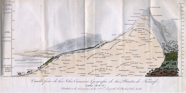
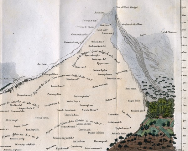
For instance, consider his picture of the distribution of vegetation on the Peak of Teneriffe in the Canary Islands. This was one his first attempts to draw a scientific concept.
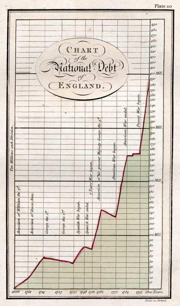
Humboldt’s drew the peak as a cross-section in order to demonstrate the relationship between elevation and the distribution of plant life. In doing so, he was inspired not by other maps, but — as he himself admitted, the charts of national debt made wildly popular by William Playfair. Compare Playfair’s chart of British national debt, for instance, with Humboldt’s cross-section of Teneriffe. Both the chart and the cross-section attempt to collapse and synthesize a significant amount of data into a visual form to represent change over time (Playfair) and diversity across space (Humboldt).
Humboldt turned toward pictographic techniques because traditional maps were insufficient to convey the topographic drama and vegetative diversity he encountered in the Americas. Geographical maps were imperfect, he wrote, because “the undulations of the surface, the form of the mountains, their relative height, and the rapidity of the declivities, can only be completely represented in vertical sections.”
As he explained, each region ought to have not one but two maps, for while the astronomer seeks locational accuracy, the geologist seeks complex representations of stratigraphy. Thus he turned to illustrative techniques to represent this dynamism, but also to reveal further elements of interdependence in the natural world.
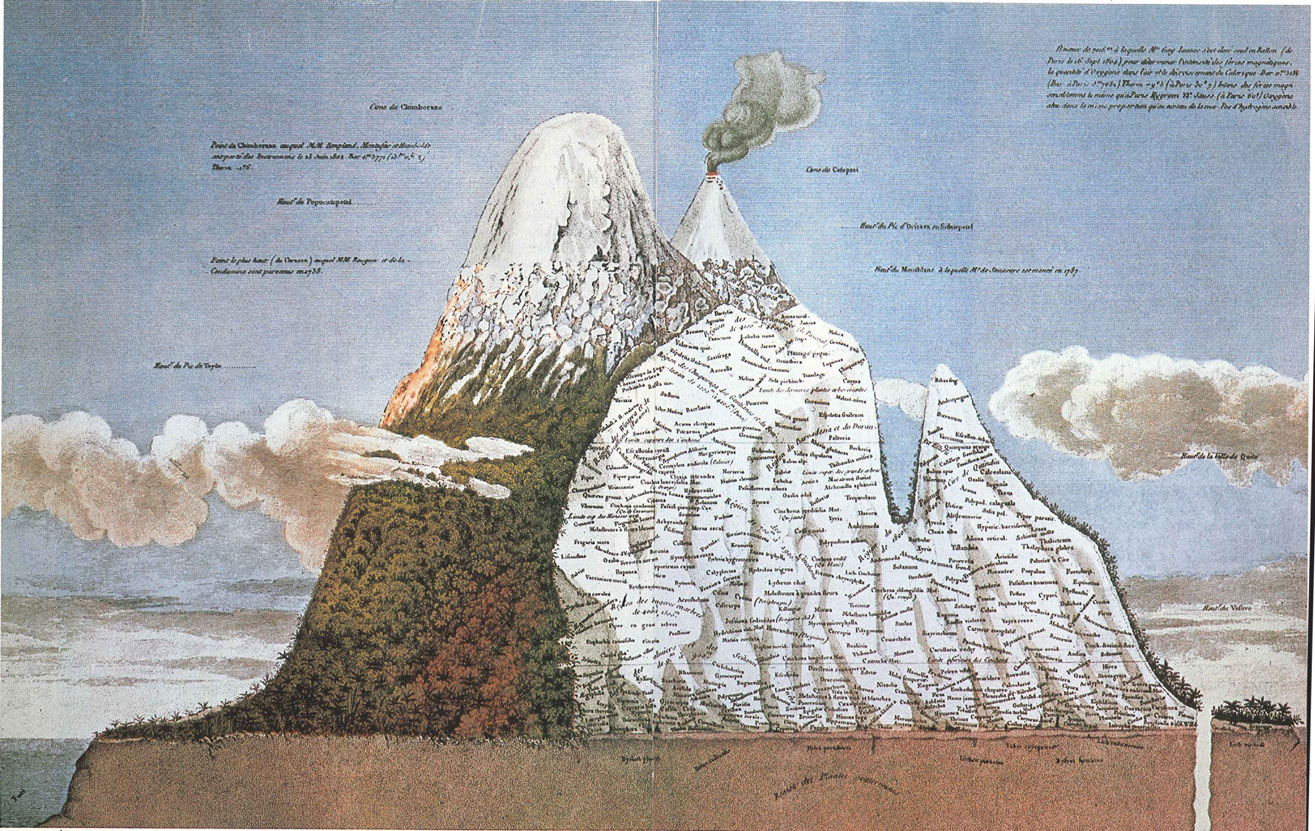
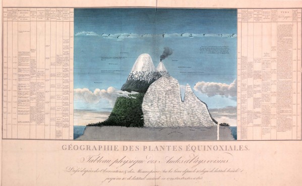
As a result of his wide-ranging efforts, Humboldt is credited with broadening the science from description to explanation in the nineteenth century. In his mind, the key questions were about the relationships between phenemona, which he tried to capture most ambitiously in his massive cross-section of Chimborazo in 1807.
The image is flanked by extensive descriptions, his attempt to correlate vegetation to everything from altitude to zoological life to rainfall and temperature. It is fascinating to think about the way he came to these ideas in part through visual and infographic technqiues. In short, Humboldt was determined to break the bounds of a map.
Use controls to zoom and pan.
[…] A diagram on the distribution of vegetation on the Peak of Teneriffe in the Canary Islands, by naturalist Alexandre von Humboldt. Humboldt’s biogeography was harnessed by French thinkers to create historical vegetation data, aimed at reconstructing the climate of the past two thousand years. http://www.mappingthenation.com/blog/alexander-von-humboldt-master-of-infographics/ […]
[…] up to Mexico, he filled notebook after notebook with measurements, drawings, and observations. Inspired by the economic charts that had recently come into fashion, he began developing a new kind of map that would allow him […]