The nation’s first electoral map
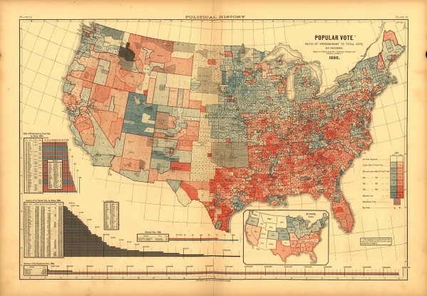
A few weeks ago I was working through the massive 1883 Statistical Atlas of the United States,and found what I believe is the first attempt to map election returns in the United States. The map is based on the publication of county election returns from the 1880 presidential election. I used it in my course on the Gilded Age, and students immediately noticed the emergence of a solidly Democratic south, just a few years after the end of Reconstruction.
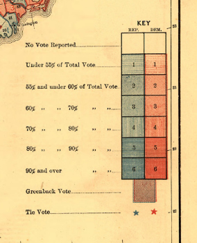
The map is particularly interesting given that it does not simply identify the returns at the state level, but involves much more finely grained data. Moreover it not only marks the victory of the Republican or Democratic (or Greenback) Party, but also measures the strength of that victory.
As I write in chapter 5 of Mapping the Nation, the map enabled viewers to think about political patterns in new and suggestive ways. One reviewer in 1883 wrote that the map raised questions about why some counties were Democratic while their neighbors were Republican. A map allowed one to correlate, in a systematic fashion, the possible geographical influences at work, including topography, climate, or historic patterns of settlement. Perhaps some counties drew particular industries that spawned protective tariffs, while others had historic traditions of abolition. All of these influences could shape the spatial pattern of party identity.
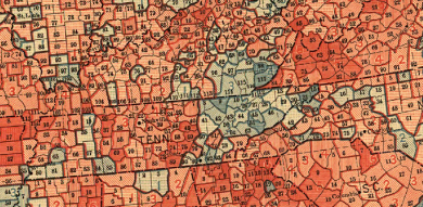
All of these possibilities could be uniquely seen, and explored, through maps of data. Only a cartographic approach could help to explain why Eastern Kentucky and Tennessee had so many Republican counties, or why so many white Arkansans voted for Garfield in the 1880 election.
In this respect the map is a great example of the way statistical and thematic maps simultaneously raised questions and provided explanations. In the process they ushered in a new way of thinking, and used aggregate data and maps to predict human behavior, which became the goal of social science.
Special thanks to Seth Masket for helping me think through the possible implications of this early map for party politics and especially the trend toward mapping elections in the twentieth century. Both the Library of Congress and David Rumsey have digitized this entire atlas.

Use controls to zoom and pan.


Great map! Thanks for sharing it!
[…] Radio Hour ▸ Sponsored by About LeftMN ▸ Scribners 1880 Popular Vote (www.mappingthenation.com). by Tony Petrangelo Nov 17, 2013, 12:00 […]
Congrats on the shout-out from Andrew Sullivan!
[…] and professor Susan Schulman stumbled onto an 1880 electoral map in her research last year, buried in an 1883 book called Scribner's Statistical Atlas of the United […]
[…] and Republicans as blue is very old, possibly the first electoral map displays them this way, as in this 1883 map of the 1880 US Presidential election’s popular […]
[…] according to Susan Schulten, a historian of cartography at the University of Denver. Schulten has written extensively about this map, which appeared in a statistical atlas published by the U.S. Census […]