An interactive map of slavery
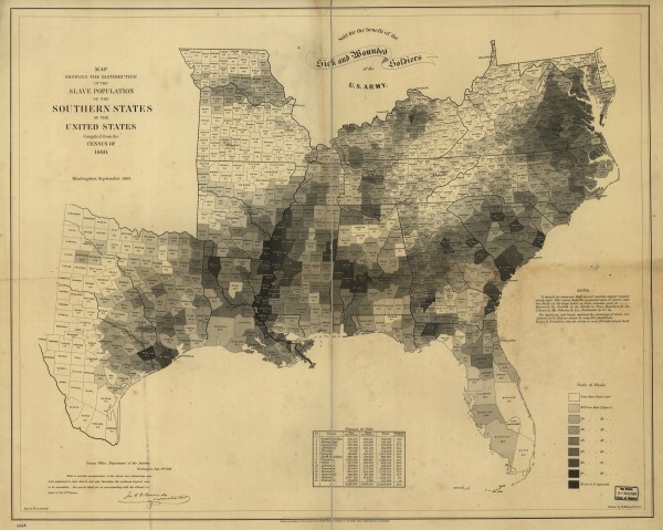
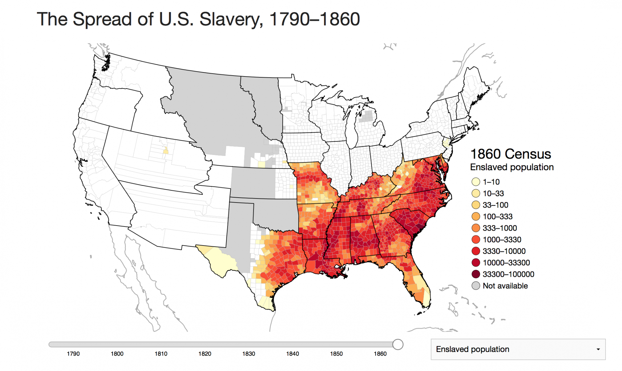
Lincoln Mullen has just posted a wonderful interactive map of slavery in the United States. His inspiration begins with the 1861 Coast Survey map of slavery, which identified the ratio of slave to the total population at the county level, based on the 1860 census data.
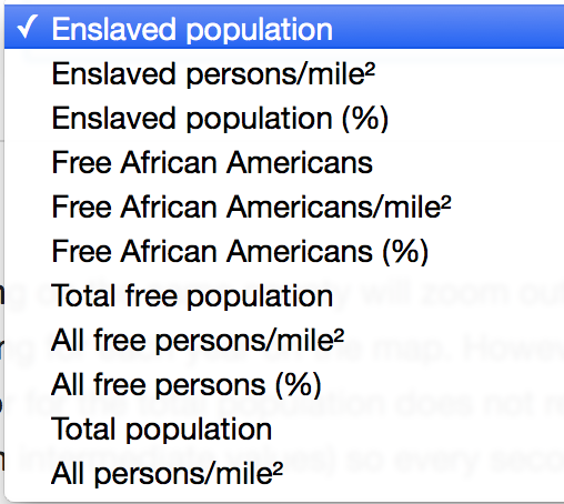
But as I’ve acknowledged here and elsewhere, even though this was a pathbreaking map, it had limitations. For instance, it did not allow for the comparison between counties, and did little to reveal the absolute strength of slavery as opposed to its proportional density of the total population. Here Lincoln (Mullen, that is) has done marvelous work in improving on the Coast Survey map by introducing several variables into the map, including absolute number of slaves, free blacks, slaves as a proportion of the total population, and even slaves per square mile. Here are the variables he offers to users, enabling them to get at a more nuanced picture of slavery over time and space:
The result is a far more complex and varied picture that we can use to speak to specific questions about the spread of slavery. For instance, one could trace across time the growth of the free African American population in any given county, or compare that population to the enslaved population or the total free population. Though such data has long been readily available through the census, Mullen’s interactive platform allows the user to determine the variable, and to investigate at a moment in time, across space, or as a chronological arc. It’s really quite remarkable, and opens up all kinds of possibilities for historians.
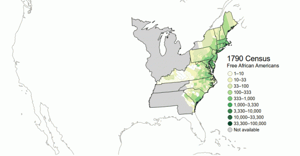
Here, for example, is the evolution of free African-American population from 1790 to 1860 (click to open animation).
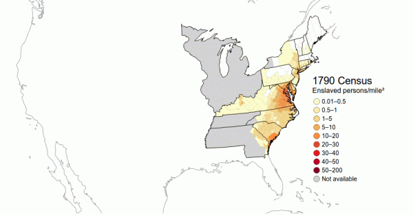
Mullen uses another animation to demonstrate that slavery spread westward at a greater rate than it intensified in a single place. So, while the free population in the northern states grew both in particular cities and across the west, in the southern states we see the spread of slavery into the southwest more than we see the increase in density in a single geographical region. Take a look:
This is a very powerful geovisualization of the argument made by Steven Deyle’s Carry Me Back, an extensive investigation of the slave trade in the United States.
The work Lincoln has done is really remarkable, and a great service to historians and the historically curious alike. Take a look for yourself to see the many ideas he’s raised about history, historical geography, and demographics.
Use controls to zoom and pan.
